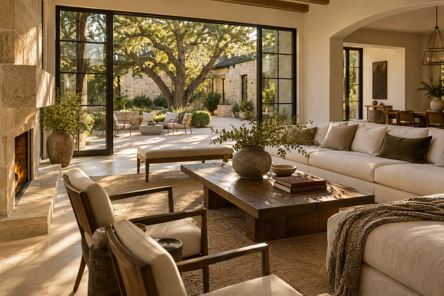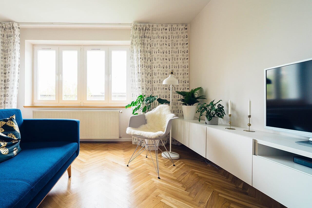
A small square of color on a white paper swatch rarely tells the full story of how a room will feel once the walls are transformed. When you stand in a North Texas living room under the bright midday sun, a soft grey might look crisp and modern. However, as the evening shadows stretch across the floor, that same shade could appear heavy or even muddy.
The Paper Trail Problem
The challenge often arises not during the initial selection, but during the decision-making process itself. Imagine you spend a Saturday visiting various local suppliers, collecting a dozen different swatches that look remarkably similar under the fluorescent lights of a store. You return home, spread them out on the kitchen counter, and feel a sense of progress. Two weeks later, when you are ready to finalize the order, you find yourself staring at a collection of unlabeled scraps. You cannot remember if the pale sand shade was 'Option A' or 'Option B,' and you certainly cannot recall which one you tested against the light in the hallway.
Without a clear record, you risk selecting a color based on a fleeting memory rather than the actual visual evidence you gathered. This creates a tradeoff between the speed of making a choice and the accuracy of the result. A quick decision might lead to a color that feels wrong once the entire room is coated, while a meticulous tracking system requires an upfront investment of time and organization.
Testing with Intent
To avoid this confusion, treat your samples as active participants in the room rather than static objects. Instead of taping small paper chips to the wall, consider applying larger samples directly to the surface or using sturdy boards that can be moved. This allows you to observe the color in various corners of the room and against different furniture textures.
Most importantly, create a physical link between the sample and its identity. Use a permanent marker to write the specific name or code on the back of each sample board. If you are using a digital photo to track your progress, ensure the label is visible in the frame. This creates a decision record that remains understandable even if you step away from the project for several days.
Observing the Light
A color is never a static entity; it is a reaction to the light available in your specific space. To make a fair comparison, you must observe your samples at different intervals. For example, if you are painting a bedroom, check the samples in the bright morning light, during the afternoon, and under the glow of your bedside lamps at night.
Ask yourself how the shade interacts with the specific lighting fixtures you currently have installed. Does the color become too vibrant when the sun hits it directly? Does it lose its warmth when the overhead lights are dimmed? By documenting these observations alongside your labeled samples, you can move forward with a selection based on how the color actually performs in your home.