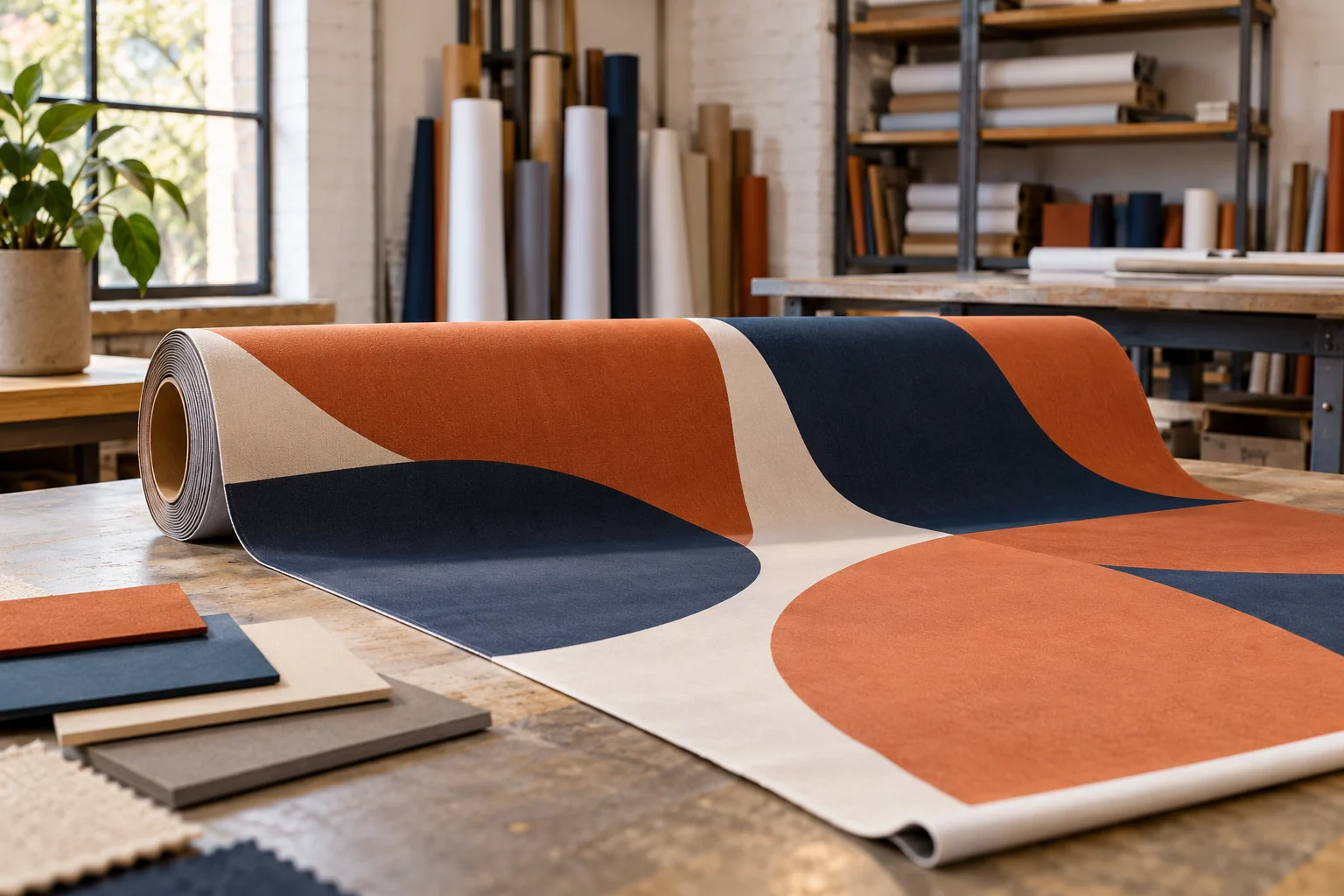
Selecting a visual identity or a website layout often happens through a screen, a process that can feel disconnected when you are managing a project from a home office in Plano or a coffee shop in Fort Worth. When you are comparing different design directions remotely, the distance can make it difficult to articulate why one option feels right and another feels wrong. The temptation is to rely on gut feelings, but those feelings are often difficult for a professional to translate into tangible changes.
The trap of personal taste
The most common hurdle in a design review is the confusion between personal preference and functional necessity. You might find yourself staring at a deep navy blue background and thinking, "I personally prefer forest green," or looking at a minimalist font and deciding it feels too cold. While your taste is valid, a designer is tasked with solving a problem for a specific group of people, not just creating something that pleases your individual eye.
If you provide feedback based solely on what you like, you create a tradeoff: you might end up with a beautiful aesthetic that fails to communicate your brand's purpose to your actual customers. The goal is to move the conversation from "I like this" to "This works because..."
Identifying the core problem
Before suggesting a visual fix, identify the underlying issue you are sensing. If a layout feels "off," ask yourself if the issue is the hierarchy of information, the readability of the text, or the way the images interact with the margins. A designer cannot fix a feeling, but they can fix a structural or communicative error.
For example, if you are reviewing a new digital brochure for a local service business, you might feel the design is "cluttered." Instead of asking to "make it cleaner," which is subjective, observe the specific friction point. Is the contact information getting lost among the decorative elements? Is the font size making the service descriptions difficult to scan? Identifying the friction allows the designer to apply a technical solution rather than guessing at your aesthetic desires.
Questions for your creative partner
When you are reviewing options remotely, use targeted questions to bridge the gap between your vision and their execution. Rather than dictating the solution, ask questions that allow the professional to explain their logic. This helps you understand if a design choice was intentional or an oversight.
- Ask how this specific color palette or typeface aligns with the target audience we identified in the brief.
- Ask how the current layout handles the amount of text we expect to use in our daily operations.
- Ask if the visual weight of the elements directs the viewer toward the primary action we want them to take.
By focusing your feedback on the intended use and the target audience, you transform the remote review process from a series of subjective disagreements into a collaborative effort to meet your business objectives.